healthcare
Company
Role
Sr. UX/UI Designer
medium
Responsive Web
timeline
2019
Overview
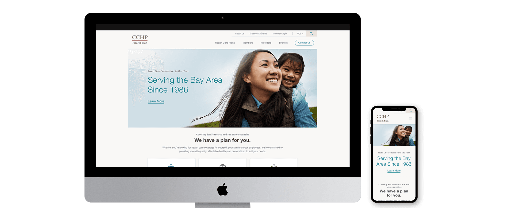
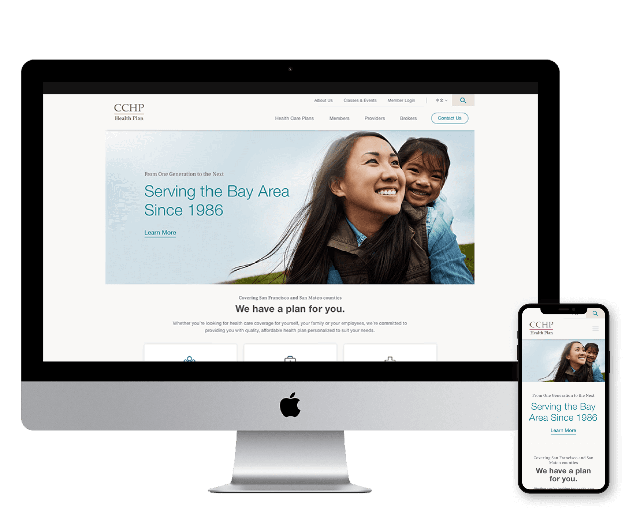
In mid-2019, my team and I were approached by the marketing team at CCHP (Chinese Community Health Plan) to undertake a full redesign of their website. CCHP is a San Francisco-based healthcare company serving the Asian community within San Francisco and San Mateo counties in the Bay Area.
At the time, their website faced several challenges: it wasn’t responsive, navigation was cumbersome for users, and the overall design felt outdated. This redesign was a key part of a broader strategy to modernize their digital presence, attract a younger and more diverse audience, and continue to support the needs of their existing customer base while reinforcing the company’s reputation for reliability.
Challenge
We needed to redesign the site from the ground up, aiming for a launch by mid-September to ensure everything was ready before Open Enrollment in October. This gave us just three months to design and develop a fully responsive website that could be easily maintained by employees with limited technical expertise.
Adding to the challenge, CCHP was in the process of finalizing a new brand identity, but none of the assets were ready for us to use. As a result, the UI and visual design had to be flexible enough to adapt to the eventual branding. Additionally, we needed to account for multilingual support across the site, as it would be available in English, Chinese Mandarin, and Spanish.
Another hurdle was gathering accurate information to build the site’s information architecture. Years of employee turnover had resulted in the loss of key institutional knowledge, making it difficult to confirm the correctness of the content we needed.
Lastly, we had to work within a very tight budget, which required keeping exploration lean. I often stepped into cross-functional roles, such as handling production tasks and manually entering translated copy into the CMS, to ensure the project stayed on track.
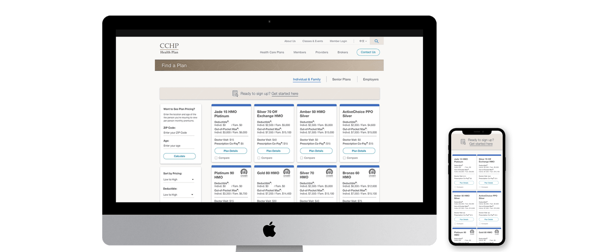
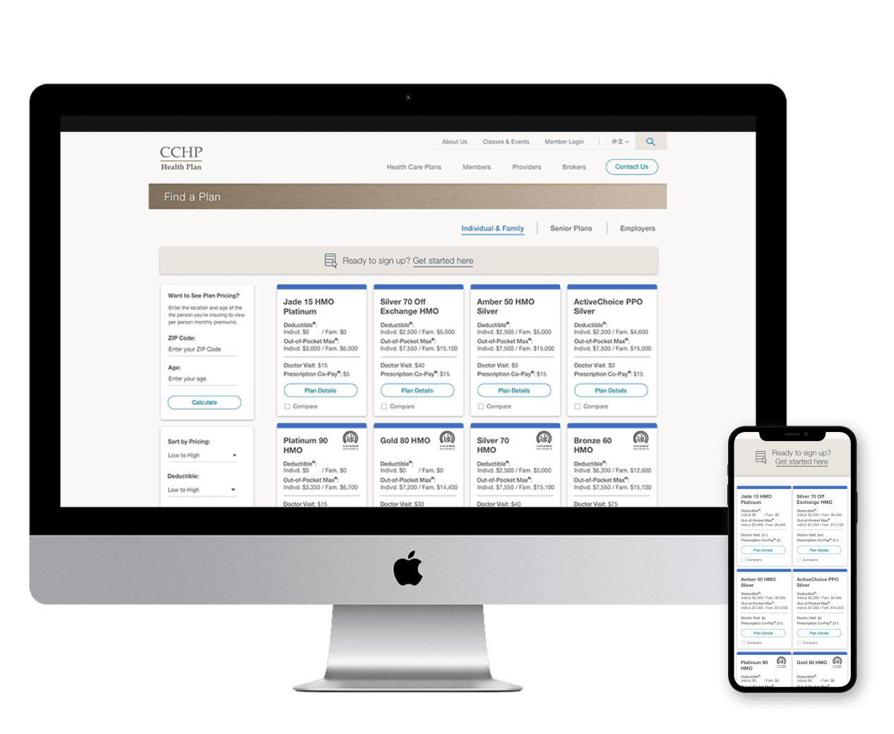
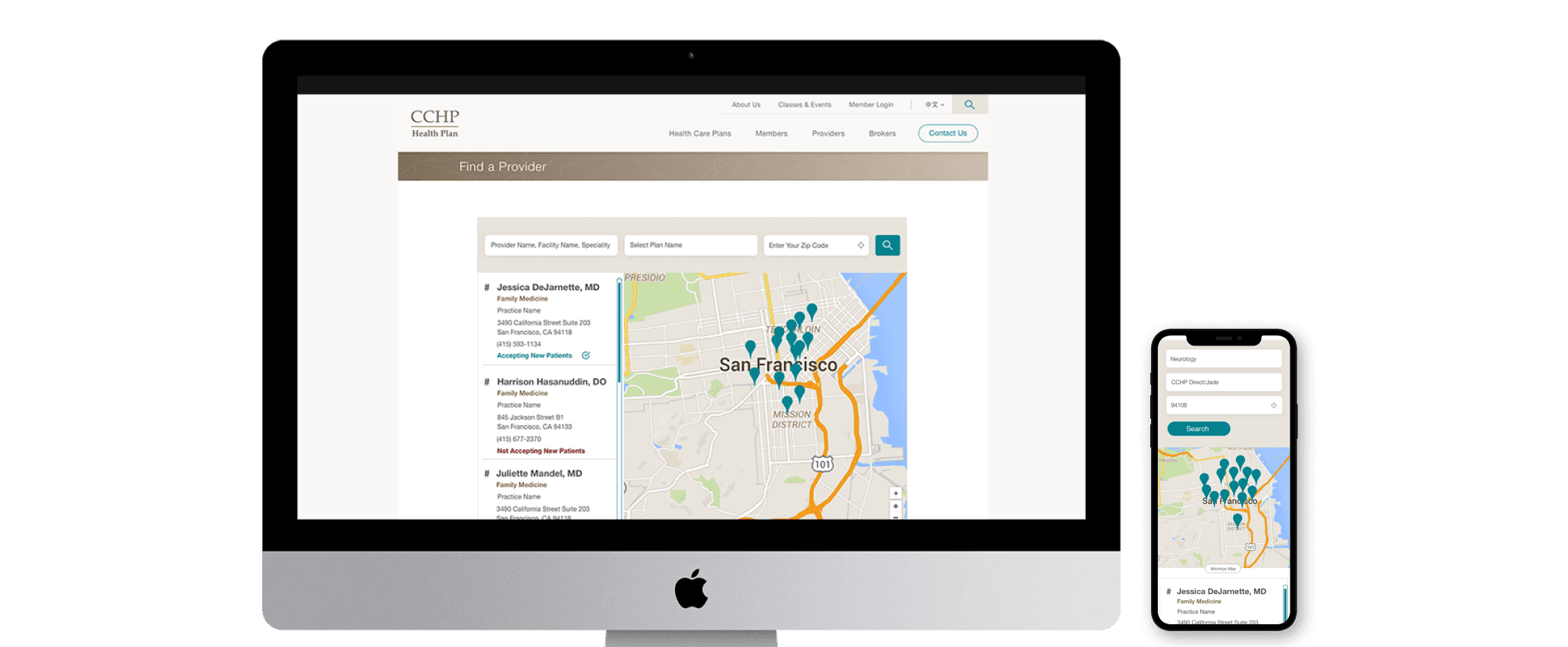
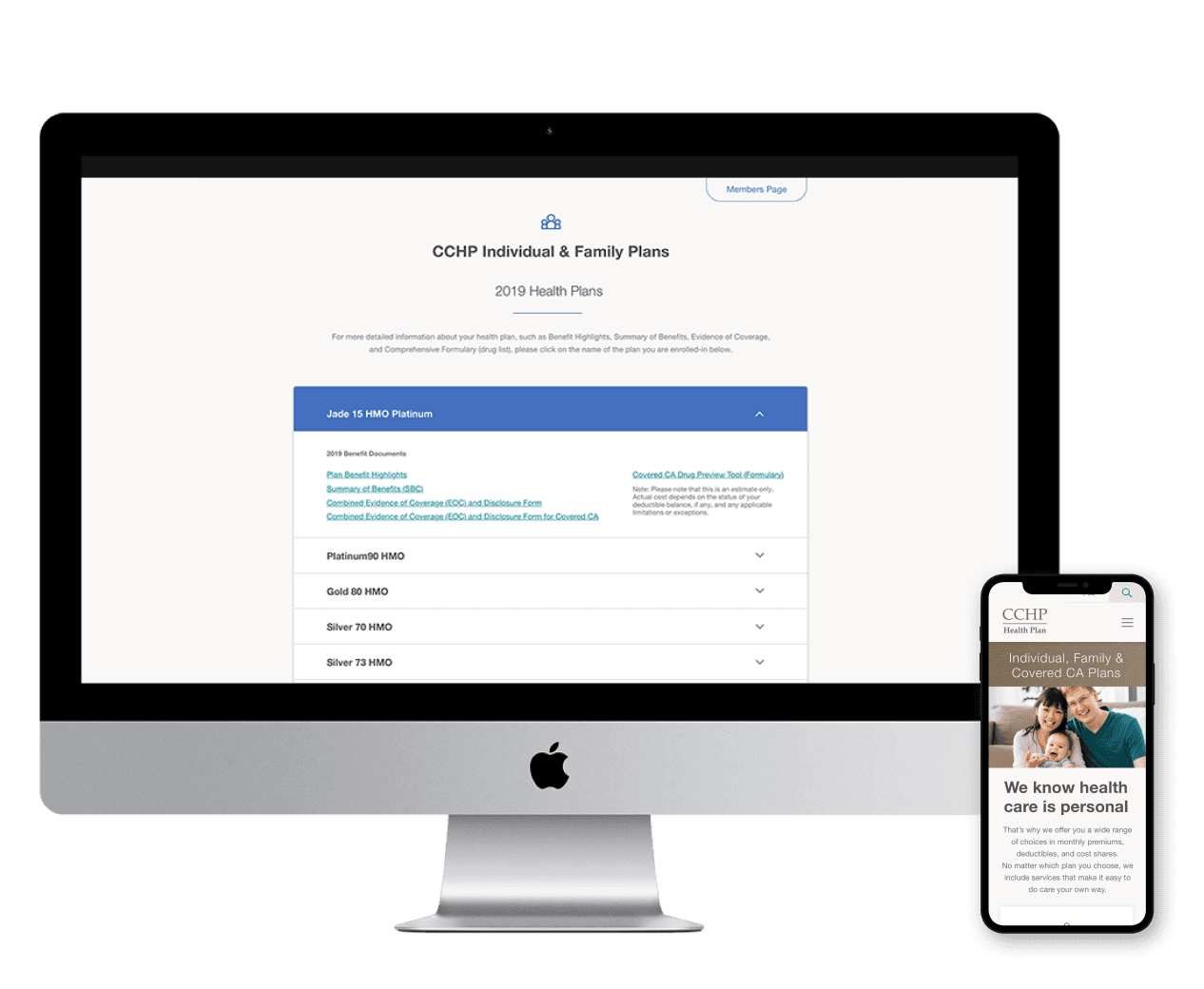
Find a Plan screen
Users
CCHP’s primary audience consists of individual consumers (both current and potential customers), with a smaller segment of small business owners in the San Francisco area. Additionally, the site serves providers, including doctors and office staff from the local community.
Historically, the majority of CCHP’s customers have been aged 50 and older. However, with their rebranding and new strategy, they aim to expand their reach and appeal to younger audiences beyond their traditional customer base.
Role
As the lead designer for this project, my responsibilities included:
Restructuring the site’s architecture
Conducting competitive research within the market
Creating wireframes for all site sections
Collecting feedback and securing approvals from clients and stakeholders
Developing a general UI palette that would seamlessly integrate with the new branding
Handing off designs and providing support to the development team
Assisting project management by entering copy into the site CMS for both Chinese Mandarin and Spanish language support
Additionally, I led and collaborated with two part-time designers, who provided valuable support throughout the project.
Site Audit
CCHP’s website was outdated, non-responsive, and overwhelmed with outdated information. The confusing site layouts and poor architecture made it difficult for users to quickly find what they needed. It was evident that the site required better organization to improve navigation and streamline the user experience. Some pages contained minimal content, while others were overloaded with endless links to PDFs. After reviewing the content, we identified opportunities to consolidate or eliminate many of these pages to create a more intuitive and efficient structure.
Competitor
Research
Having previously worked on healthcare websites focused on both coverage and medicine, my team and I had a solid understanding of the functionality and features essential for helping users find the ideal health insurance plan. For example, the ability to compare current plans—a crucial experience—was entirely missing from CCHP’s existing site. We ensured this functionality was included in our scope, along with a provider search feature for users to easily locate doctors within the CCHP network. Additionally, I researched how comparable companies addressed similar challenges to inform and refine our solutions for CCHP.
User
Research
Due to the tight time constraints, we were unable to conduct user testing. Instead, we relied on internal feedback and input from stakeholders to guide our decisions. I also collaborated closely with the engineering team to identify a CMS that was intuitive and user-friendly, ensuring CCHP employees could easily manage updates such as blog posts and new plan documents without requiring extensive technical knowledge.
Kicking Off
In early June 2019, our team—comprising representatives from product management, engineering, design, and strategy—visited CCHP headquarters in San Francisco to gain deeper insights into the company’s needs, vision, and goals for their new website. During our kickoff meeting with the CCHP team, we learned that the current site was underutilized by visitors, a significant issue as internet traffic increasingly shifts toward mobile. Addressing this problem meant delivering a solution that was easy to navigate, highly functional, and visually appealing—all within a tight budget and timeline.
Goals
Following our kickoff, the key goals for the project included:
Increasing web traffic by 40% within the first year
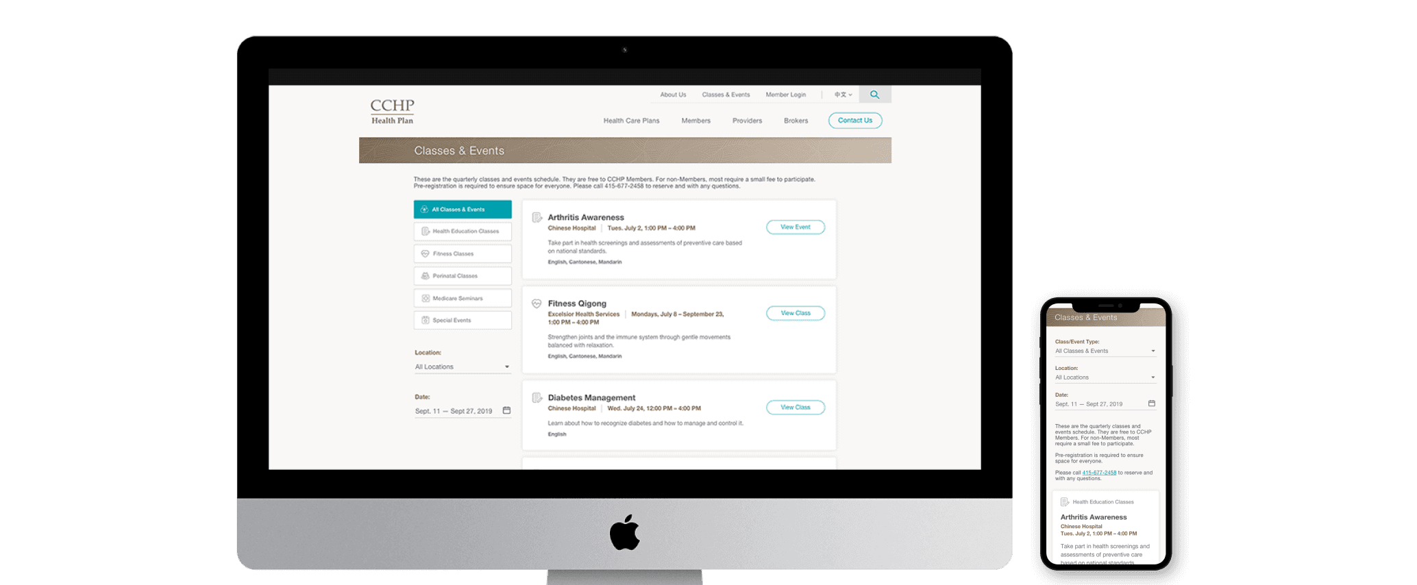
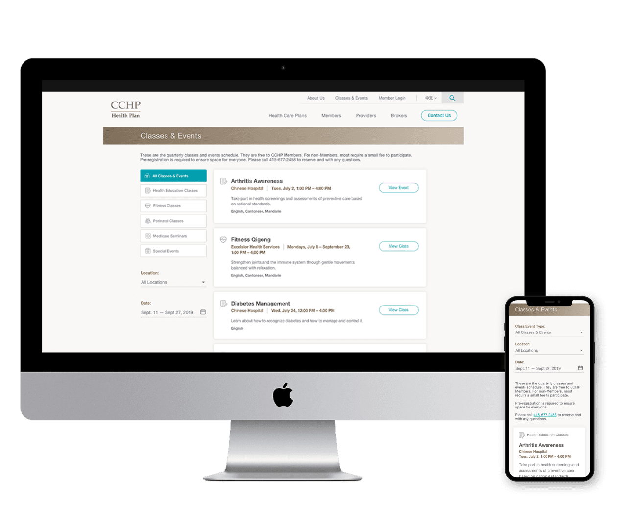
Making the site fully responsive across all devices
Designing a flexible site that could adapt to both the current and future branding
Implementing a quick-quote feature for plan options
Improving the organization and accessibility of information
Creating an attractive design to appeal to new customers
Adding robust search functionality
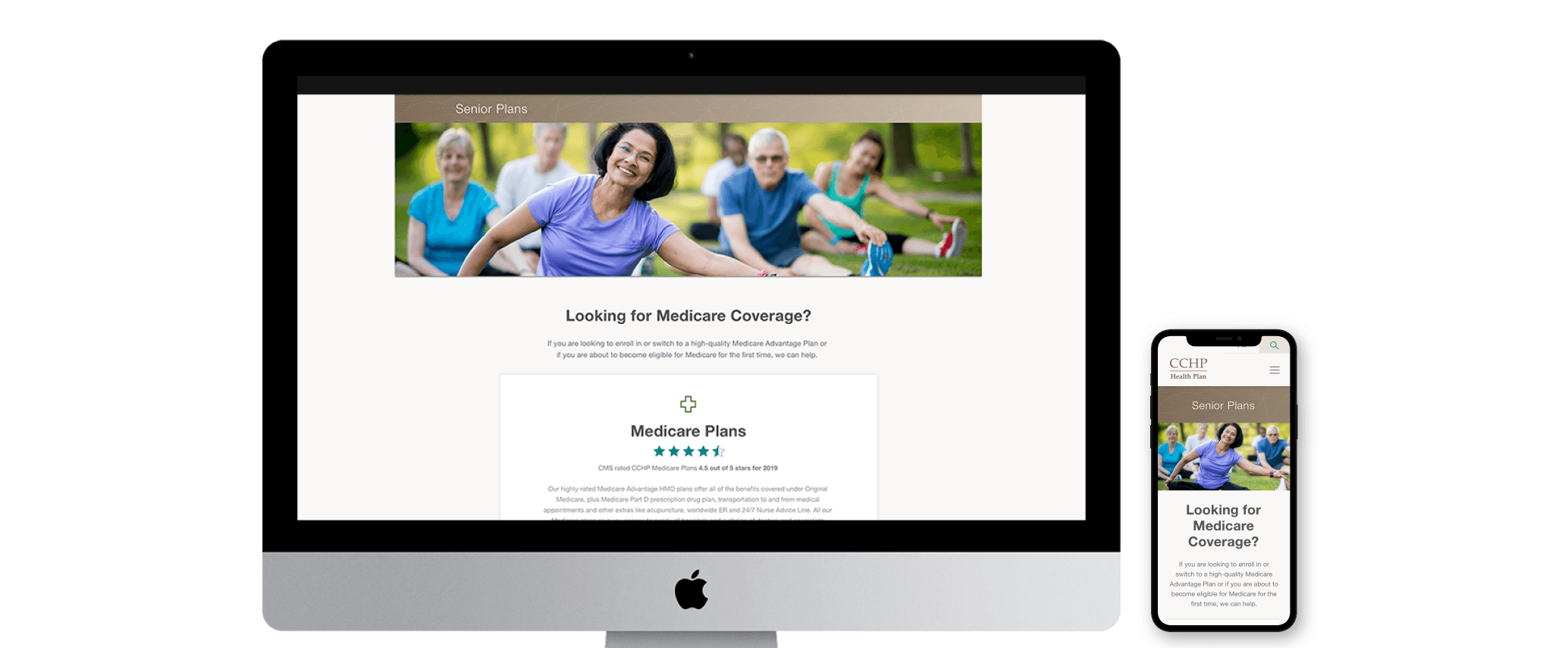
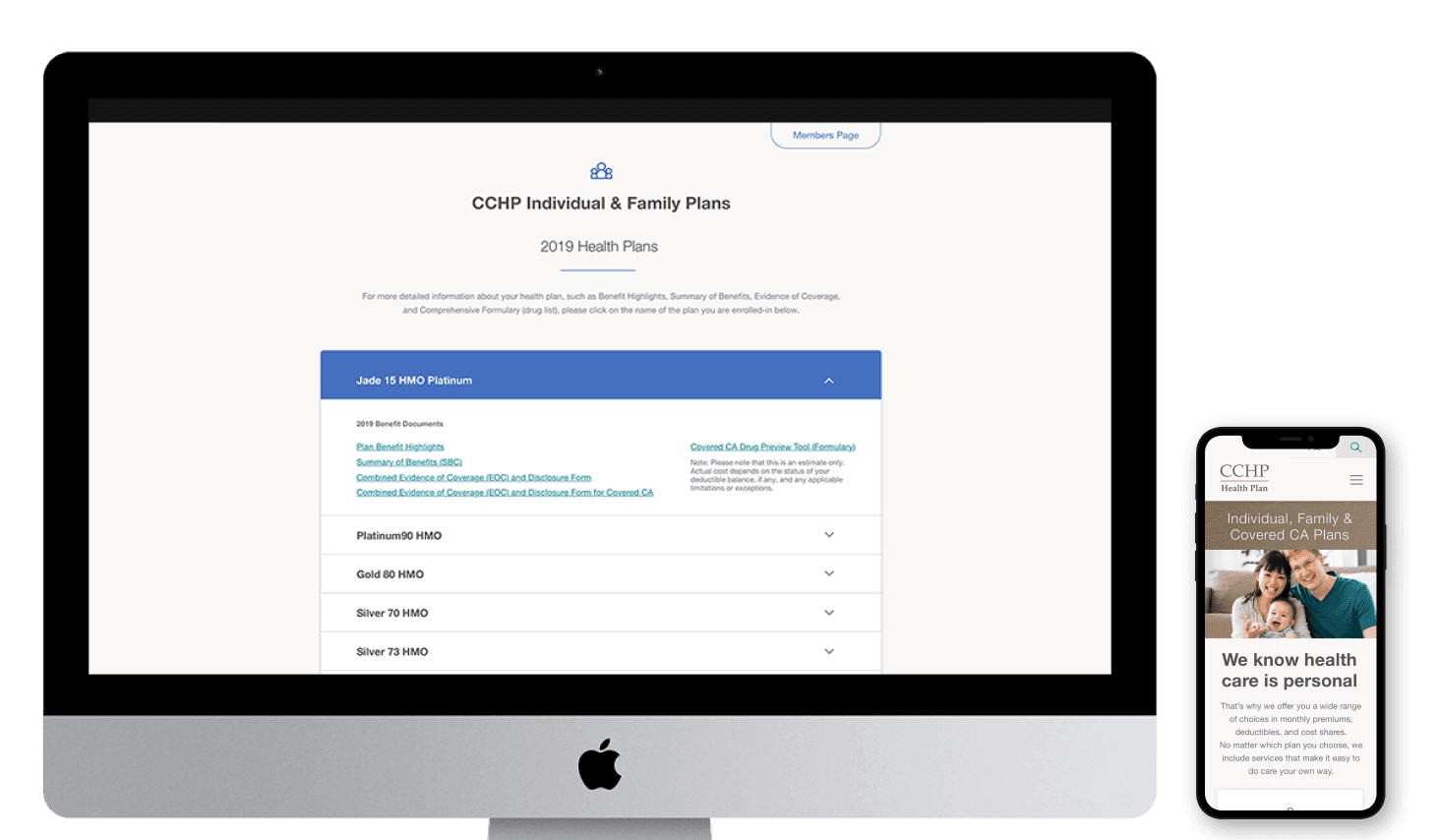
Displaying all plan types (Individual & Family, Employer Group, and Medicare-based plans) directly on the site, rather than relying on PDFs
First Steps
After completing my initial research, I conducted a deeper analysis of the existing CCHP website to identify opportunities for better organization. This process involved close collaboration with the CCHP team to determine which content was essential and where we could streamline or eliminate redundancies. Ultimately, this led to a newly restructured information architecture for the site. The process not only helped my team and me consolidate related content—merging individual pages with small paragraphs into more cohesive sections—but also allowed the CCHP team to perform a quicker audit of their information from an external perspective, identifying what was outdated or unnecessary.
With a clear understanding of the content, I moved on to sketching wireframe ideas. Given our tight timeline, I proposed creating a set of versatile templates that could be tailored and reused across different sections of the site. This approach also simplified the development process for the engineering team by providing consistent structures to build from.
Once the wireframes were reviewed and approved by both my internal team (PMs and engineering) and the client, we shifted to designing initial UI concepts. At this stage, I collaborated with two additional designers. Each of us proposed different ways to visually represent the site, particularly focusing on how to handle multi-language support. As the lead, I facilitated discussions to evaluate how each approach aligned with the client’s goals. My leadership philosophy emphasizes giving everyone a voice in the creative process, ensuring we collectively decide on the best path forward.
Rolling Along
Working closely with the engineering team, we developed a game plan to prioritize which screens needed to be handed over first, ensuring all teams stayed on track to meet our deadlines. We broke the work into several sprints over a 2.5-month period, which allowed us to stay aligned with the project timeline and deliverables as we passed off content and designs to engineering.
The first sprint focused on establishing the style guide, including elements like buttons, links, forms, and templates for various pages. We also tackled the more complex, functional pages. With the initial delivery of sample UI screens for the client’s review, we covered the majority of these elements, but sprint one allowed us to refine the style further. This foundation made sprints two and three smoother, as they were more focused on content production.
Finish Line
In a sprint workflow, communication is critical. With the tight deadline we faced, this project really tested the strength of communication between design and engineering. It required us to address issues as they arose, and to ask questions and collaborate openly. After weeks of rapid design production, coming up with solutions on the fly, and supporting the engineering team as much as possible, even stepping outside of the design role to assist with translations, we successfully delivered the site on time.
However, due to delays in receiving regulatory approval for the 2020 healthcare plans, we couldn’t meet our original launch date, which was beyond both our and CCHP’s control. We also encountered issues with missing PDF documents that were required for launch. Despite these setbacks, we went live in late September 2019, allowing CCHP enough time to market their new site ahead of Open Enrollment. We also successfully launched full support for all three languages (English, Spanish, and Chinese).
Looking Back
Overall, despite the unique challenges we faced, I’m pleased with the outcome of this project. It demonstrated the strong partnership between design and engineering, tested my quick thinking skills, and highlighted the importance of stepping outside job titles to get things done. That said, looking back, there are a few things I would have approached differently:
Exploratory Phase: Unfortunately, because I wasn’t involved in setting the design budget, we didn’t have the opportunity for an exploratory phase. Having this time would have allowed us to identify potential constraints and evaluate the amount of content we needed to handle, ensuring we didn’t cut into the design budget.
Full-time Copywriter: While not entirely within our control, it would have been helpful to have a full-time copywriter on the project. There were opportunities to improve content, not just through design but also in the copy itself. Much of the copy was carried over from the existing site, and while this was outside the scope of our project, I did recommend it to the client.
User Research: I would have made more time for user research, specifically seeking feedback from both current and potential users. This would have been beneficial for the project itself and could have informed the client’s ongoing rebranding efforts.
More Time for UX: Given the tight timeline, I feel we did the best we could, but more time would have allowed for a more refined UX. For example, too much time was spent on setting up the site map, which could have been completed in half to three-quarters of the time.
Layouts for Document-heavy Pages: More time should have been allocated to exploring different layouts for pages with a high volume of documents. Time and budget constraints made this more challenging, but it would have been ideal to have more resources to explore these options.
